The hourly chart and 1 minute charts are shown. Once the price started ranging there was a move from the top Bollinger Band to the bottom band

The hourly chart and 1 minute charts are shown. Once the price started ranging there was a move from the top Bollinger Band to the bottom band
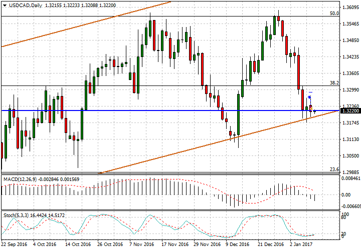
This buy stop didn’t work, though it was impulsive and not planned very well. (I still think the Daily chart is interesting). The two tails in the first chart that look almost like a mini “tweezers bottom” got my attention
Even though when looking back Oil was was selling off – the dollar index was consolidating, USD/CAD moved up just past where the buy order was filled, but then down past a couple 4 hr candle lows.
A rule of not placing trades when I’m preparing to leave was broken, regardless of whether the trade was profitable.
Charts below
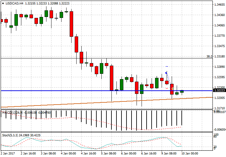
Daily still looks interesting


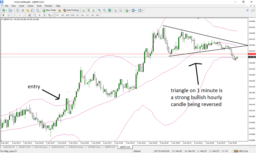
This was a scalp for a couple of pips shown on a 1 minute chart
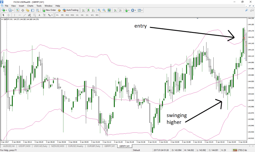
I’m showing the entry with what could be a hint of the move to come (swinging higher)
We need to monitor price action to determine when to NOT wait for the lower band area to be reached before taking long positions. The second image has a nice entry around the mid band, which is a 20 period moving average. Can you find it?
I’m not showing the hourly chart in this example, however it was the main reference time frame. Really, this can be considered against trend, as it was a short trade.