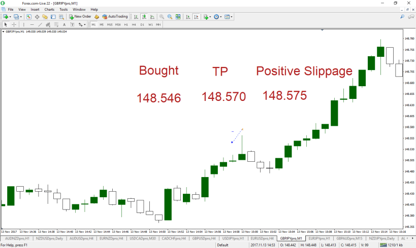
Here are a few trades on the 1 minute chart.
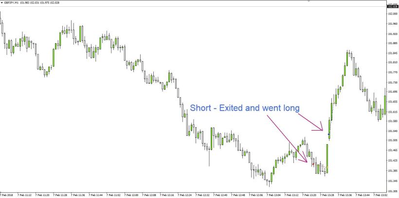
Then later in the day
I simplified the charts. This is how I was looking at the second trade in real time.
It took off later (after I exited) all the way to a larger trend line I had drawn.
Here are a few trades on the 1 minute chart.
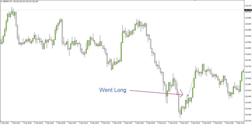
Then later in the day
I simplified the charts. This is how I was looking at the second trade in real time.
It took off later (after I exited) all the way to a larger trend line I had drawn.
Last week we had a large move on the Dow.
Depending upon what type of analysis was being done, there may have been several ways to trade this day.
If a short term chart is mostly being used, it may be challenging to get into a trade once a predetermined level was taken out and the price isn’t pulling back much.
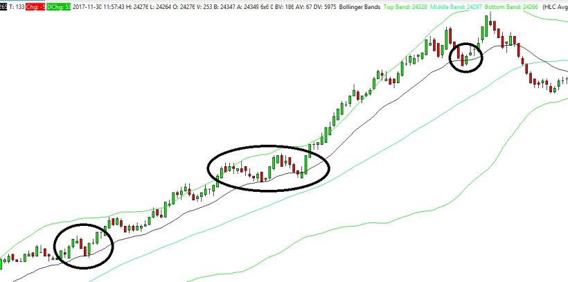
Let’s take a closer look-
Some people will use something like this below, to determine when a trade can be taken. A simple 20 period moving average may be of some help. Patience is key here.
The circles are where price comes to the moving average.
The first one had no clear candle pattern that would be helpful. However, that could have been a profitable trade without price ever really moving against a long position.
The second one took a decent bounce off of the level and pulled back. The second bounce (the right side of the circle) looked even better.
The third one was a nice inside bar exactly at the moving average
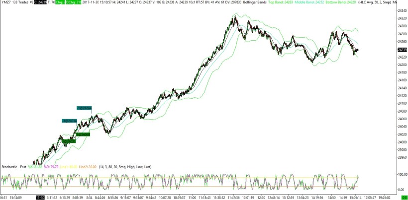
This is a 1 minute chart. I believe I was referring to the 5 minute when the trade was entered
Now that I made a post or two after a while, I’ll remind you that whatever trades I highlight are my own, and no system or approach is being promoted. Many trades on this page can be considered discretionary, and you’ll notice there isn’t only one template being used.
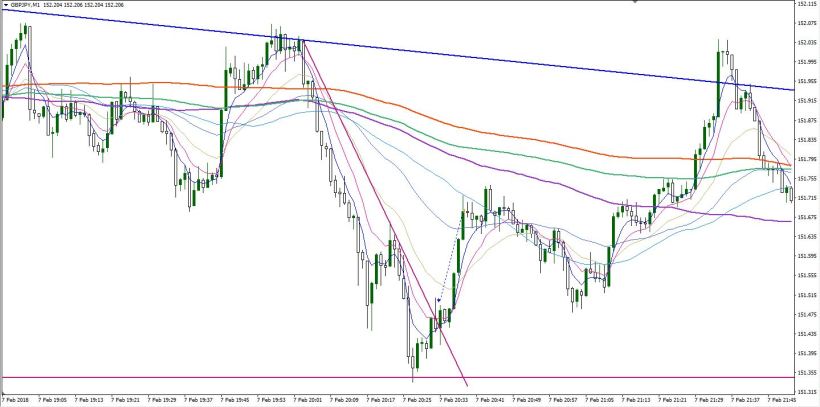
This trade looked different than it does below as it was made on a mobile device and the template had Bollinger bands and a couple of lines drawn.
I wanted to post it because there are a few interesting things ( to me) to note.