Here are 4 short trades:
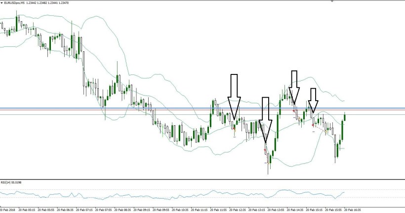
The blue line represents the 1.2350 level. It’s good to be aware of the “50’s” and the whole numbers such as 1.2300, 1.2400 etc.
A similar trade was taken on AUD/USD.
Here are 4 short trades:
The blue line represents the 1.2350 level. It’s good to be aware of the “50’s” and the whole numbers such as 1.2300, 1.2400 etc.
A similar trade was taken on AUD/USD.
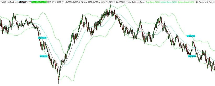
let’s take a look at a zoomed out chart.
These are “fast” charts, meaning things are taking place very quickly depending upon what type of approach you are used to.
Regardless, keep in mind we can apply much of this to any time frame. These are short entries.
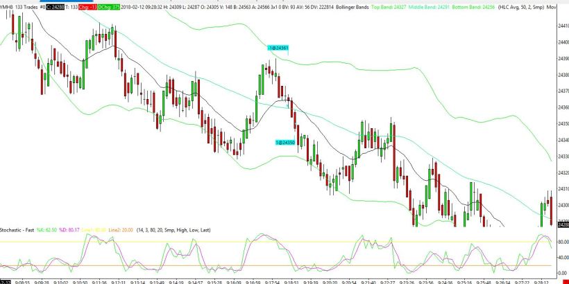
Since we refer to bands, entries and exits should be reviewed to see how we are sticking to guidelines. For Example, price was travelling down fast and the entry took place below the moving average and middle band.
Also, do you notice a triangle formation?, it turned out the short entry was near the bottom of that. It can also be noted that price didn’t test the moving average until many ticks lower.

The chart graphics make it seem like the entries and exits were better than in reality. In this case there were some ticks gained however the actual entry was was right about at the middle band.
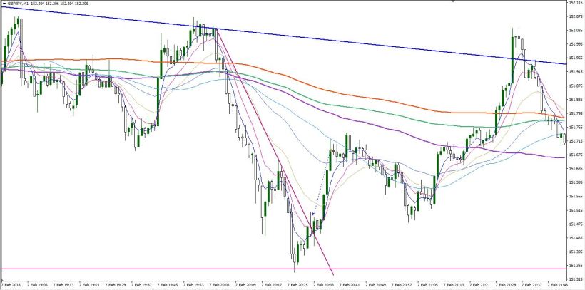
Here are a few trades on the 1 minute chart.
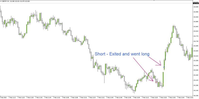
Then later in the day
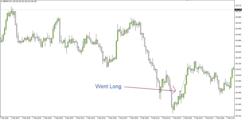
I simplified the charts. This is how I was looking at the second trade in real time.
It took off later (after I exited) all the way to a larger trend line I had drawn.